BLOG
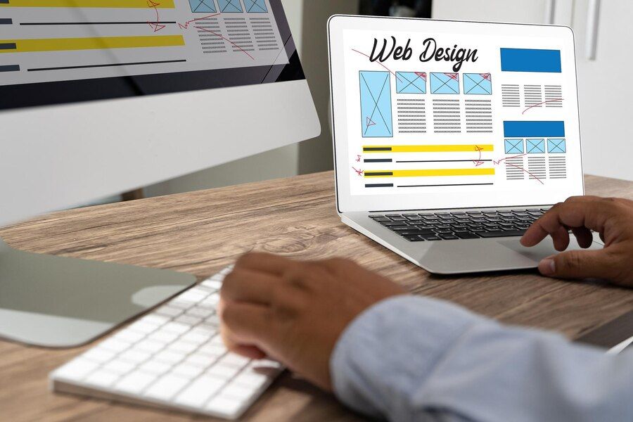
Crafting Fluid Grid Layouts for Responsive Design
Crafting fluid grid layouts is an essential skill for any web designer aiming to create responsive and adaptable websites. In an era where users access the internet through various devices with different screen sizes, ensuring that your website looks and functions seamlessly across all platforms is paramount. Fluid grid layouts provide the foundation for achieving this goal by allowing content to dynamically adjust and reorganize based on the user's viewport.
In this blog, we delve into the intricacies of crafting fluid grid layouts for responsive design. From understanding the principles of fluidity and proportion to implementing flexible CSS frameworks such as Bootstrap or Foundation, we'll explore techniques to create layouts that effortlessly scale and rearrange elements while maintaining visual harmony. Whether you're a seasoned developer seeking to refine your skills or a newcomer eager to learn, this guide will equip you with the knowledge and tools necessary to master fluid grid layouts and elevate your web design projects to the next level.
Understanding the Importance of Fluidity in Web Design
Fluidity in web design refers to the ability of a layout to adapt and respond seamlessly to different screen sizes and devices. In today's digital landscape, where users access websites from a multitude of devices, from smartphones to large desktop monitors, achieving fluidity is paramount.
A fluid layout ensures that content is displayed optimally regardless of the viewport dimensions, providing a consistent and user-friendly experience. It allows websites to gracefully adjust and reorganize elements, maintaining visual appeal and functionality across various platforms. By understanding the importance of fluidity, web designers can create responsive layouts that cater to the diverse needs of modern users, ultimately enhancing engagement and satisfaction.
Exploring the Fundamentals of Grid Systems
Exploring the fundamentals of grid systems is essential for any web designer striving to create visually appealing and well-structured layouts. Grid systems provide a framework that divides the layout into columns and rows, facilitating alignment and balance of content elements. By understanding these fundamentals, designers can create cohesive and user-friendly web experiences that adapt seamlessly across different devices and screen sizes.
- Grid systems form the backbone of responsive web design.
- They enable alignment, consistency, and balance in layout composition.
- Understanding column widths, gutter spacing, and responsive breakpoints is crucial.
- Mastery of grid fundamentals ensures layouts adapt smoothly to various screen sizes.
- Whether using traditional grids or modern CSS frameworks, grid knowledge is indispensable.
Delving into the fundamentals of grid systems empowers designers to create layouts that are visually appealing, structured, and responsive. By mastering concepts such as column widths, gutter spacing, and breakpoints, designers can create cohesive and adaptable web experiences that enhance user engagement and satisfaction. Whether employing traditional grid systems or modern CSS frameworks, a solid understanding of grid fundamentals is essential for crafting effective and user-friendly layouts.
Implementing Flexible CSS Frameworks for Responsive Layouts
CSS frameworks such as Bootstrap and Foundation provide pre-designed components and stylesheets that streamline the process of creating responsive layouts. These frameworks offer a wealth of features, including grid systems, typography settings, and UI components, allowing designers to build responsive websites quickly and efficiently.
By leveraging flexible CSS frameworks, designers can focus on customizing and fine-tuning layouts to suit their project requirements while ensuring cross-browser compatibility and accessibility. Whether starting from scratch or working with existing templates, implementing CSS frameworks empowers designers to create responsive layouts that are both visually compelling and user-friendly.
Leveraging Media Queries for Device-Specific Adaptation
Media queries are CSS rules that allow designers to apply styles based on specific device characteristics, such as screen width, height, and orientation. By leveraging media queries, designers can create device-specific adaptations that enhance the user experience on smartphones, tablets, and desktops. For example, a website may utilize media queries to adjust font sizes, reposition navigation menus, or hide certain elements on smaller screens.
By tailoring the layout and design to different devices, designers can ensure that users receive an optimized experience regardless of how they access the website. Effective use of media queries is crucial for creating responsive designs that adapt seamlessly to the ever-changing landscape of digital devices.
Strategies for Creating Seamless Transitions Between Breakpoints
Breakpoints are specific screen widths at which the layout of a webpage changes to accommodate different device sizes. Transitioning smoothly between breakpoints is essential for maintaining visual coherence and usability across devices. Designers can employ various strategies to create seamless transitions, such as using CSS transitions and animations to gradually adjust element properties.
Additionally, designers should pay attention to content hierarchy and prioritize important elements to ensure that the layout remains intuitive and functional at every breakpoint. By carefully planning and testing transitions between breakpoints, designers can create responsive layouts that provide a consistent and enjoyable user experience across all devices.
Optimizing Images and Media for Fluidity and Performance
Images and media assets play a crucial role in web design, but they can also impact the performance and fluidity of a website if not optimized properly. To ensure smooth loading and rendering across devices, designers should optimize images by compressing file sizes, choosing appropriate file formats, and implementing responsive image techniques.
Similarly, video and audio content should be optimized to minimize load times and bandwidth usage. By prioritizing performance optimization, designers can create fluid layouts that load quickly and provide a seamless user experience, even on bandwidth-constrained or mobile devices.
Enhancing User Experience with Fluid Typography and Font Scaling
Enhancing user experience with fluid typography and font scaling is essential in creating visually appealing and accessible websites. By implementing techniques that allow text to adapt dynamically to different devices and screen sizes, designers can ensure readability and consistency across platforms.
- Fluid Typography: Allows text to resize proportionally, ensuring optimal readability across devices.
- Font Scaling Techniques: Utilize viewport-based typography and CSS viewport units to adjust font sizes dynamically.
- Consistent Readability: Ensures text remains legible regardless of screen size or device.
- Enhanced Usability: Improves accessibility and user experience by optimizing text display.
- Cohesive Design: Contributes to a visually appealing and consistent website layout across platforms.
Incorporating fluid typography and font scaling techniques is crucial for enhancing user experience and ensuring readability in responsive web design.
Overcoming Common Challenges in Crafting Fluid Grid Layouts
Crafting fluid grid layouts presents designers with common challenges to ensure seamless user experiences across devices. From maintaining visual hierarchy to handling complex layouts, these hurdles require careful attention.
- Maintaining Visual Hierarchy: Elements may appear differently on various screen sizes, leading to inconsistencies.
- Handling Complex Layouts: Dealing with intricate designs that require precise alignment and spacing.
- Ensuring Cross-Browser Compatibility: Different browsers may interpret CSS rules differently, affecting the layout's appearance.
- Responsive Images and Media: Optimizing them for fluidity while maintaining performance.
- Testing and Debugging: Identifying and resolving unexpected behavior across devices through thorough testing and debugging.
Ensuring cross-browser compatibility and optimizing responsive media are also critical. Thorough testing and
debugging help identify and resolve unexpected behavior. Overcoming these challenges is essential for creating fluid grid layouts that provide consistent user experiences.
Testing and Debugging Across Various Devices and Viewports
Testing is a critical phase in the development of responsive websites, ensuring that layouts function as intended across a wide range of devices and viewport sizes. Designers should utilize testing tools and browser developer tools to preview and debug layouts on different devices and screen resolutions.
Additionally, designers can leverage device emulators and online testing platforms to simulate real-world conditions and identify potential issues. By conducting thorough testing across various devices and viewports, designers can identify and address inconsistencies, layout discrepancies, and performance bottlenecks, ultimately ensuring a seamless user experience across all devices.
Future Trends and Innovations in Responsive Design and Fluid Grid Layouts
As technology continues to evolve, so too will the landscape of responsive design and fluid grid layouts. Emerging trends and innovations, such as CSS Grid Layout, variable fonts, and container queries, are poised to revolutionize the way designers create and implement responsive layouts.
Designers can expect to see greater flexibility, control, and creativity in crafting fluid grid layouts that adapt to the unique needs of users and devices. By staying informed about emerging trends and experimenting with new techniques, designers can push the boundaries of responsive design and create innovative layouts that anticipate and accommodate the future of web browsing.
Mastering the art of crafting fluid grid layouts for responsive design is essential for creating visually appealing and user-friendly websites that adapt seamlessly to various devices.
By understanding the importance of fluidity, exploring the fundamentals of grid systems, implementing flexible CSS frameworks, leveraging media queries, and employing strategies for seamless transitions between breakpoints, designers can create layouts that enhance user experience and engagement. Additionally, optimizing images and media, enhancing typography, overcoming common challenges, and conducting thorough testing are crucial steps in ensuring the success of responsive design projects.
As we look to the future, staying abreast of emerging trends and innovations will enable designers to continue pushing the boundaries of responsive design and creating innovative layouts that meet the evolving needs of users and devices. If you're ready to take your website to the next level and dominate the competition, contact us at Social Cali Manteca Marketing Strategies. Our proven expertise and dedication will help your business thrive in the digital landscape.